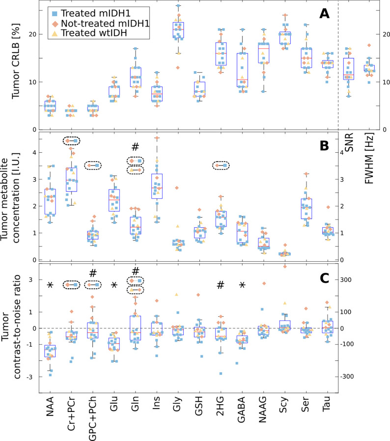
FIG. 6:
Group analysis of the metabolites within the tumor region of interest (ROI) and normal appearing brain in glioma patients. The shape and color of each point represent the patient group, and the box plots display the median, 25th, and 75th percentiles for all patients. The A plot shows the mean values of Cramer-Rao lower bound (CRLB), signal-to-noise ratio (SNR), and linewidth (FWHM) within the tumor ROI. The B plot shows the mean metabolite concentration within the tumor ROI in IU. The C plot shows the contrast-to-noise ratio (CNR) between the tumor ROI and normal appearing brain. ANOVA with post-hoc multiple comparisons across the three groups was performed for each metabolite and the dashed ellipses with two linked points indicate groups that have a significant difference. In B and C, metabolites marked with a # indicate a significant difference, as determined by a Wilcoxon sign-rank test corrected for multiple comparisons, in the tumor concentration or in the contrast-to-noise ratio (CNR) between treatment-na”ive mutant IDH1(R132H) patients and other patients. In C, the * denotes metabolites for which the median CNR value computed over all patients was significantly different from zero (corrected Wilcoxon signed-rank test). In all plots only the ROI voxels with CRLB < 30% were included in the analysis.

