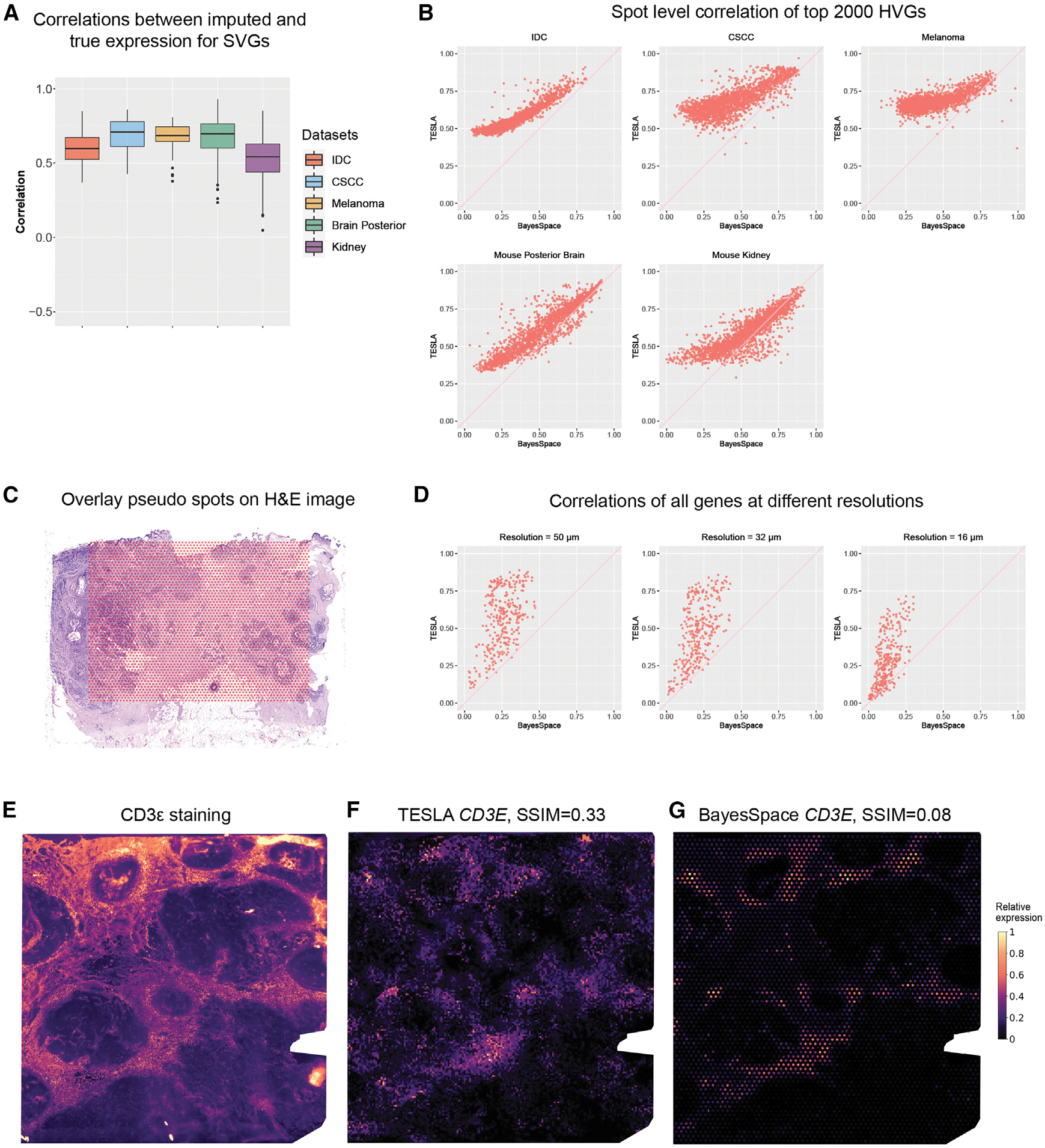
Figure 2. Evaluation of super-resolution gene images from TESLA.

(A) Boxplot of Pearson correlations between the original gene expression and TESLA’s imputed gene expression for masked spots for SVGs detected by SpaGCN. Each point in the boxplot represents a gene. SpaGCN detected 68 SVGs (n = 68) from the IDC dataset, 85 SVGs (n = 85) from the CSCC dataset and 30 SVGs (n = 30) SVGs from the cutaneous malignant melanoma dataset. The lower and upper hinges correspond to the first and third quartiles, and the center refers to the median value. The upper (lower) whiskers extend from the hinge to the largest (smallest) value no further (at most) than 1.5× interquartile range from the hinge. Data beyond the end of the whiskers are plotted individually.
(B) Scatter plots of Pearson correlations between the original spot-level gene expression and “spot-level” gene expression obtained from the enhanced expression generated by TESLA and BayesSpace for the top 2,000 highly variable genes selected by BayesSpace for the five datasets. Each dot in the plot represents a gene.
(C) Spot layout of the pseudo-Visium data derived from 10× Xenium breast cancer dataset, in which the pseudo spots are overlayed on the H&E image.
(D) Scatter plots of Pearson correlations between observed gene expression in Xenium and enhanced gene expression generated by TESLA and BayesSpace at different resolutions for all 313 genes in Xenium. Each dot in the plot represents a gene.
(E) Intensity of the CD3ε immunofluorescence staining. Intensity was scaled to (0, 1) for visualization.
(F) Super-resolution gene expression image of CD3E from TESLA.
(G) Super-resolution gene expression image of CD3E from BayesSpace.
