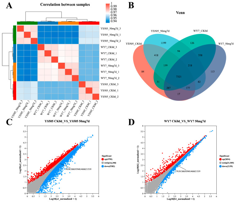
Figure 1.
Analysis of gene expression between transcriptome samples: (A) shows the correlation among samples; (B) is a Venn diagram, in which circles of different colors represent a processed sample, genes screened based on expression level >10, and values represent the number of common and unique genes among samples of different treatments. The sum of all numbers inside the circle represents the sum of the number of genes in the processed sample, and the cross areas of the circle represent the total number of genes in each sample. (C,D) show the gene expression differences before and after cadmium stress of YS505 and WY7, respectively. The horizontal and vertical coordinates represent the gene expression levels in the two samples, respectively, with each dot representing a specific gene.

