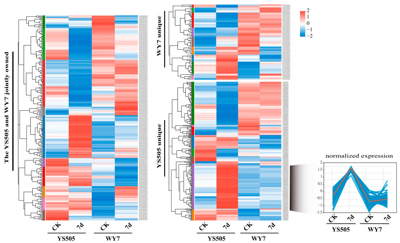
Figure 2.
Map of gene expression differences among potato varieties: Each row represents a gene in the heat map of gene clustering, and the color represents the level of expression (TPM-log10). The specific variation trend of the expression level is marked on the upper right, the tree diagram of gene clustering and the module diagram of subclustering are on the left, and the name of the gene is on the right. The closer two gene branches are, the closer their expression levels are.

