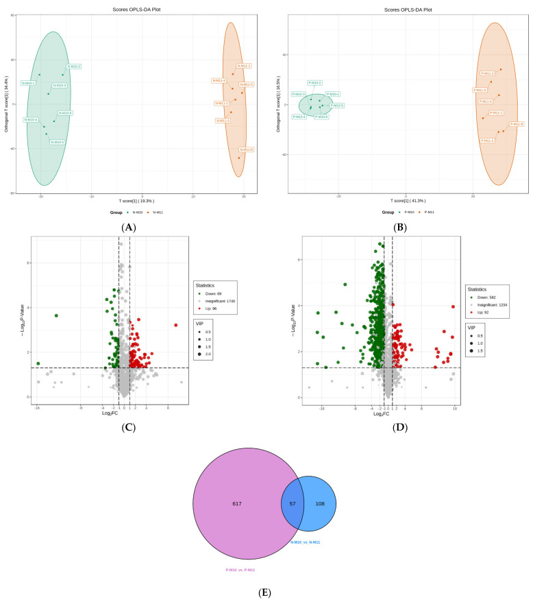
Figure 3.
The score plots of OPLS-DA pairwise comparisons between N-M10 and N-M11 (A), P-M10 and P-M11 (B). Volcano plots of the differential metabolites between N-M10 and N-M11 (C), P-M10 and P-M11 (D). Venn diagram of differential metabolites (E). The T score of the score plot indicates the degree of variations between groups, and the orthogonal T score represents the degree of variations within the group. Percentages indicate how well a component explains the dataset. The volcano plot illustrates the distribution of the up-/downregulated differential metabolites. In the venn diagram, each comparison group is illustrated as a circle, and the number in it indicates the number of differential metabolites. The number in the overlapped area of the circles indicates the number of the common differential metabolites among all the comparison groups.

