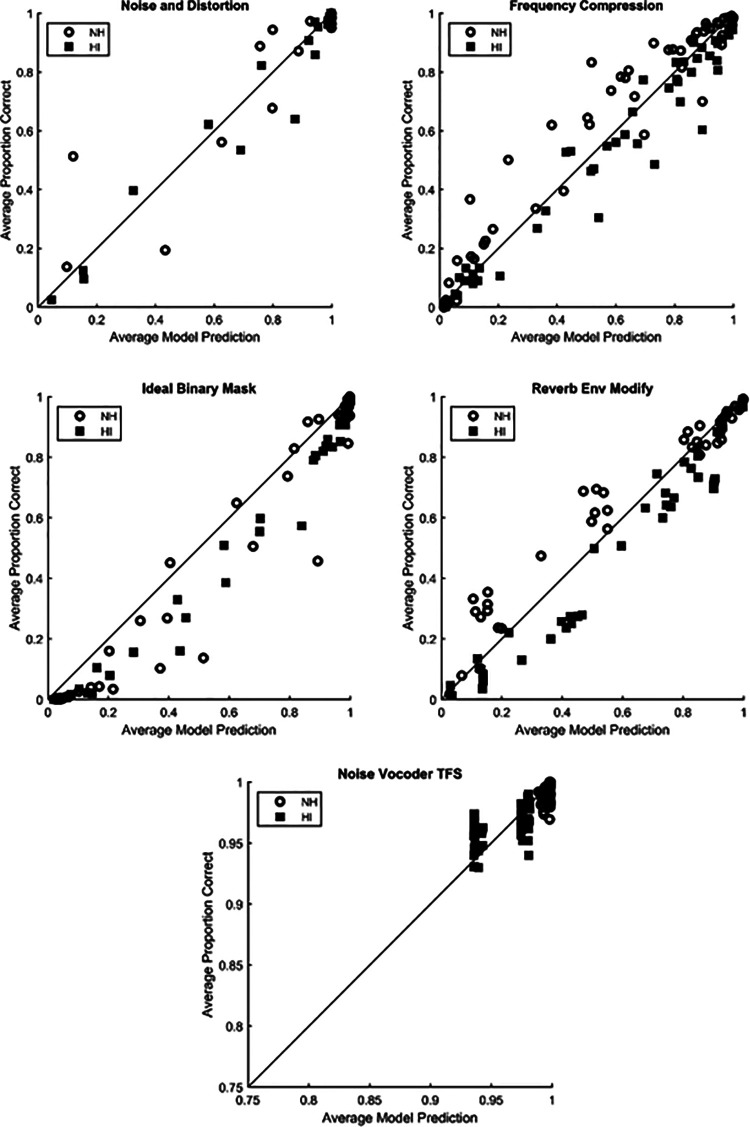
FIG. 2.
Scatterplots for HASPI w2. Each point represents the model prediction compared to the listener keyword correct intelligibility scores for a processing condition averaged over all of the listeners and stimulus repetitions for that condition. Data for NH listeners are plotted using the open circles and data for HI listeners are plotted using filled squares. The different experiments are identified in the plot titles.

