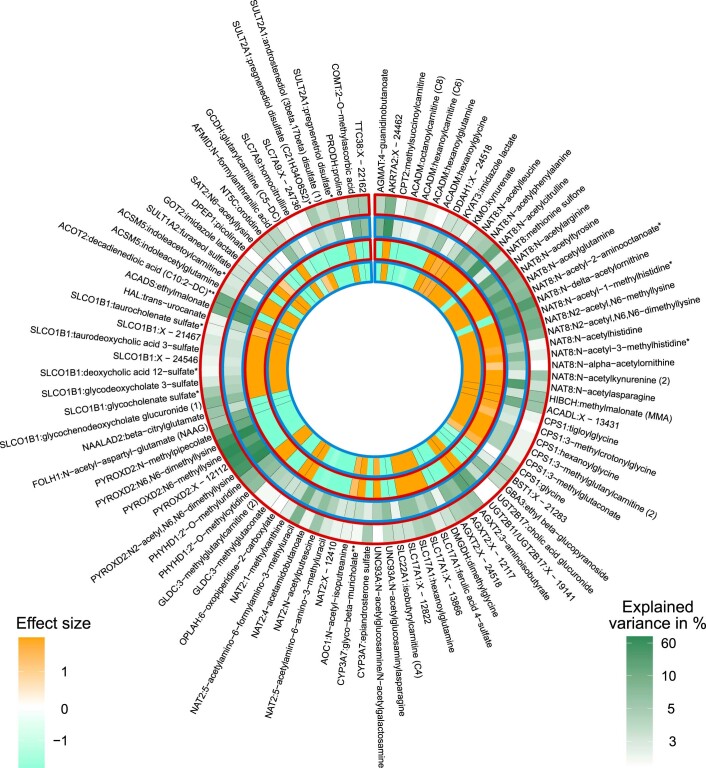
Extended Data Fig. 4. Comparison of direction of genetic associations and explained variance at inter-matrix mQTLs.
Comparison of effect sizes and explained variance for colocalization signals for mQTLs detected for the same metabolite in both plasma and urine (N = 204; only the 99 mQTLs for which the explained variance in metabolite levels in at least one of both matrices is >3% are shown). The two inner bands represent the effect size of the mQTL in plasma (framed in red) and urine (framed in blue). Shades of orange indicate positive effect sizes, shades of aquamarine negative ones. The two outer bands represent the variance in metabolite levels in plasma and urine explained by the index SNP of the corresponding mQTL, where a darker shade of green corresponds to a greater explained variance.

