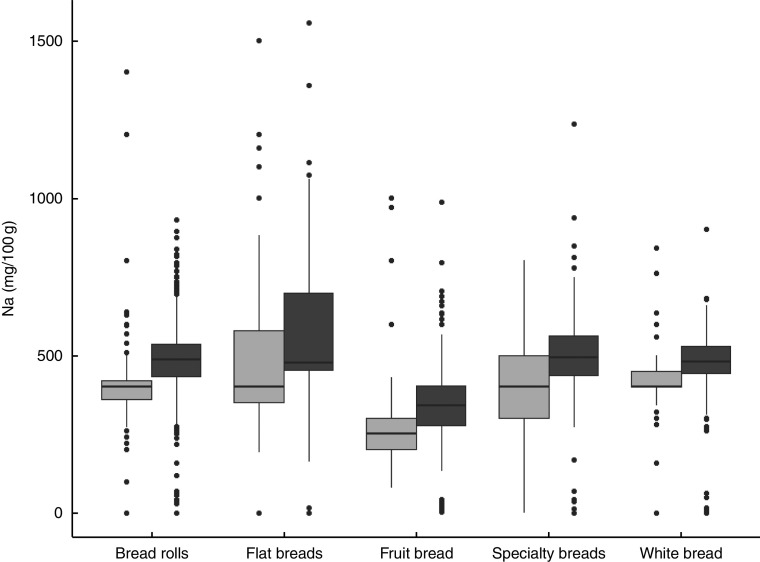
Fig. 1.
Box-and-whisker plots comparing sodium content in selected bread products by country ( , UK,
, UK,  , USA); data obtained from the US Label Insight Open Data Initiative (n 4466) in 2017 and the FoodSwitch UK database (n 1651) covering 2012–2016 (only sub-categories with fifty or more products in each country are shown). The bottom and top edge of the box represent the first and third quartiles (interquartile range); the line within the box represents the median; the ends of the bottom and top whiskers represent the minimum and maximum values; and the dots represent outliers

