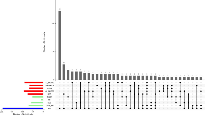
Fig. 1.
shows the burden of mixed pathologies in the aging brain. The bar chart on the lower left corner shows the frequencies of individual neuropathologic indices investigated in this study. The connected black dots on the x-axis indicate the specific combination of neuropathology represented (top 35 combinations shown). The histograms in the main panel show the frequencies of mixed neuropathologies, ordered by their frequency. The height of each bar corresponds to the number of persons with each combination

