
FIGURE 3.
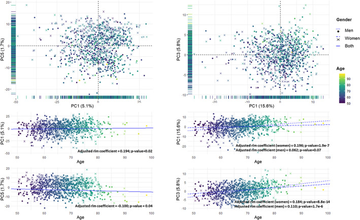
Principal component analysis of all the individuals from the study cohort. Top panel: Scores plot using all the metabolites (left) and using only those plasma metabolites significantly associated with age (right). The principal components with highest association with age are represented. The projection of the scores plot in only one component is represented in its corresponding axis. Bottom panel: Association between each principal component and age. Each dimension is represented in the x‐axis, and age is represented in the y axis. The lines represent the fitted robust linear model for the association between age and each component. A single solid regression line is represented in the cases in which there is no significant interaction between age and gender. Two regression lines are represented when there is a significant interaction, using dotted lines men and dashed lines for women. Samples are colored by age, from 50 years old (purple) to 99 years old (yellow). Men are represented using dots and women using crosses.