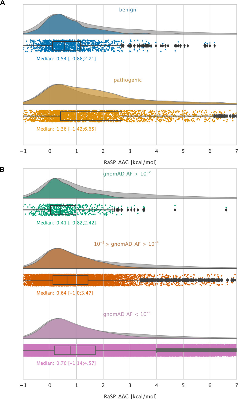
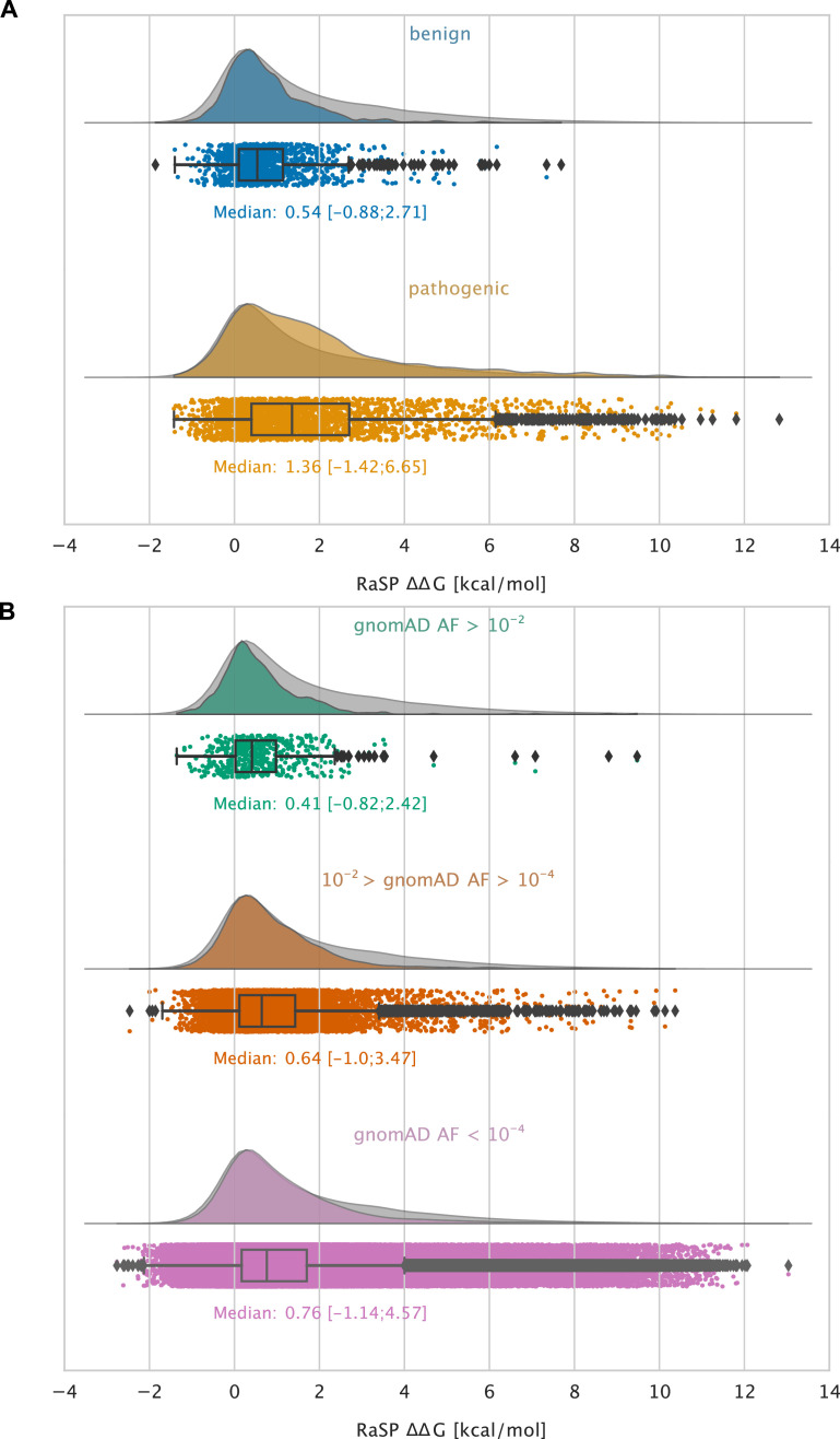
Figure 5. Large-scale analysis of disease-causing variants and variants observed in the population.
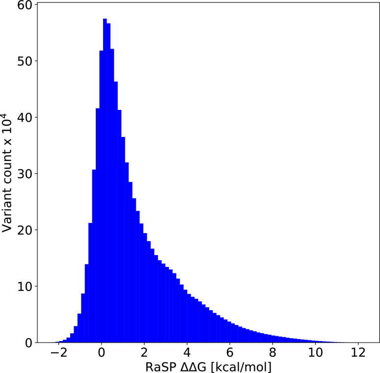
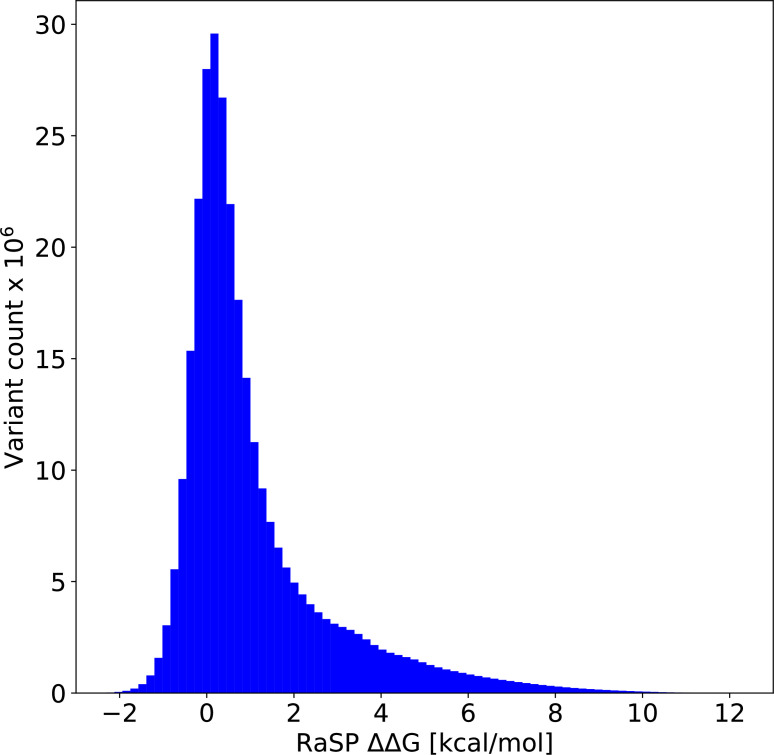
The grey distribution shown in the background of all plots represents the distribution of values calculated using RaSP for all single amino acid changes in the 1,366 proteins that we analysed (15 of the 1381 proteins that we calculated for did not have variants in ClinVar or gnomAD and were therefore not included in this analysis). Each plot is also labelled with the median of the subset analysed as well as a range of values that cover 95% of the data in that subset (box plot shows median, quartiles and outliers). The plots only show values between –1 and 7 kcal/mol (for the full range see Figure 5—figure supplement 2). (A) Distribution of RaSP values for benign (blue) and pathogenic (tan) variants extracted from the ClinVar database (Landrum et al., 2018). We observe that the median RaSP value is significantly higher for pathogenic variants compared to benign variants using bootstrapping. (B) Distribution of RaSP values for variants with different allele frequencies (AF) extracted from the gnomAD database Karczewski et al., 2020 in the ranges (i) AF>10-2 (green), (ii) 10-2 > AF>10-4 (orange), and (iii) AF<10-4 (purple). We observe a gradual shift in the median RaSP going from common variants (AF>10-2) towards rarer ones (AF<10-4).


