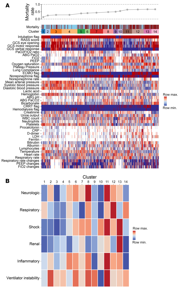
Figure 3. CarpeDiem groups patient-days into clusters representing clinical states associated with differential hospital mortality.
(A) Heatmap of 44 clinical parameters with columns (representing 12,495 ICU patient-days for 585 patients) grouped into CarpeDiem-generated clusters (clinical states) ordered from the lowest to highest mortality rates. Rows are sorted into physiologically related groups. The top row signifies the hospital mortality outcome of the patient shown in the column (blue = lived, red = died). The hospital mortality rate associated with each cluster is shown above the heatmap. (B) Heatmap of the composite signal from each cluster and physiological group with ordering the same as in A.

