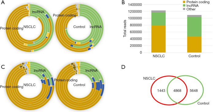
Figure 2.
Visualization of exRNA biotype distribution in the plasma. (A) A donut graph showing the differences in the total reads of the transcript biotypes; each circle represents an individual. (B) Comparison of the protein coding and lncRNA composition between the NSCLC and NC participants. (C) A donut graph showing the changes in the total transcript biotypes; each circle represents an individual. (D) A Venn diagram showing the number of transcripts in more than 2/3 of the samples in each group. NSCLC, non-small cell lung cancer; NC, normal control.

