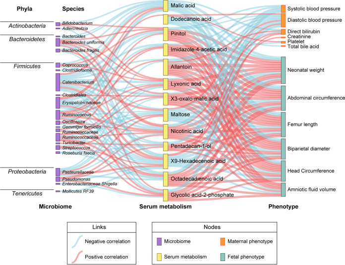
FIG 5.
Sankey diagram was depicted to visualize the relationships among microbiome, serum metabolism, and phenotypes in the cohort with 50 participants. The nodes represent omics variables; links in different colors indicate positive and negative correlations, which were calculated by Spearman correlation test, correlation coefficient |r| > 0.3, and padj < 0.05.

