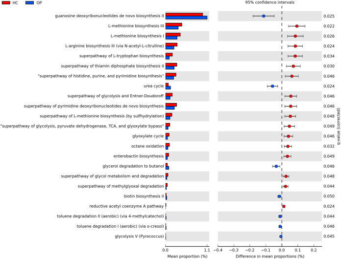
FIG 6.
Predicted differential KEGG pathways in the OP and HC groups. The extended error bar plot shows significantly differential KEGG pathways predicted using PICRUSt2 analysis and visualized using the STAMP software. The bar plot on the left depicts each KEGG pathway’s mean proportion. The circles on the left show the difference in mean population between the two groups (effect size). Only P values of <0.05 based on Welch’s test are shown.

