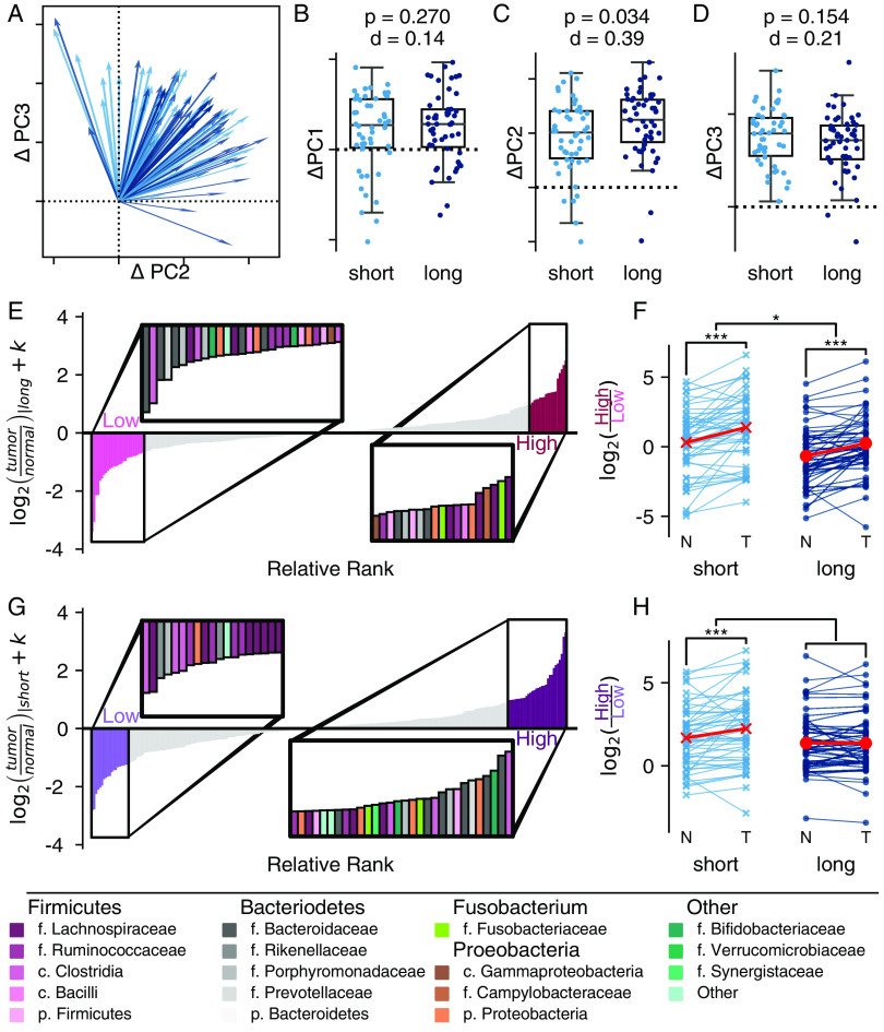
FIG 2.
The magnitude of the difference between tumor and normal tissue is associated with survival. (A) In two dimensions, the change along PC 2 and PC 3 is visualized as a vector from normal to tumor tissue. Short-term survivors (<2 year) are indicated in light blue. Long-term survivors (≥5 years) are indicated in dark blue. (B to D) The corresponding relationships can be visualized along the individual components: PC 1 (B), PC 2 (C), and PC 3 (D). Ticks along PC 2 (C) and PC 3 (D) match the two-dimensional axes in panel A. All boxplots are shown with a Cohen’s d effect size and a P value from a permutative Welch’s t test with 999 permutations, comparing the two survival groups. (E to H) A differential ranking model was fit to consider the interaction between survival and tissue. The ranks associated with tumor tissue in long-term survivors (E and F) and tumor tissue in short-term survivors (G and H) (interaction) are shown. (E and F) Relative ranks associated with the model. Insets highlight the ASVs associated with the extremes of each group. Taxonomic assignments are provided in the legend. (F and H) Additive log2 ratio associated with the ranks. Paired differences are connected by a line between normal (N) and tumor (T) tissues. The effect was modeled using a linear mixed-effects model, treating the individual as random (*, P < 0.05; **, P ≤ 0.01; ***, P ≤ 0.001).

