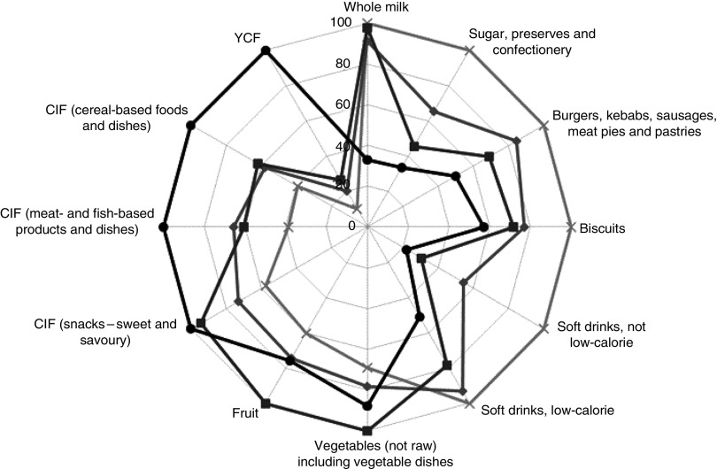
Fig. 1.
Relative mean intake in each quartile of the PANDiet ( , first quartile;
  , second quartile;
  , third quartile;
  , fourth quartile), shown as a percentage compared with the highest observed mean intake across the quartiles for twelve selected food groups*, among young children (n 1152) aged 12–18 months, UK Diet and Nutrition Survey of Infants and Young Children (DNSIYC, 2011). *The higher the PANDiet score, the better the nutrient adequacy of the diet. The twelve food groups shown are those with the highest inverse and positive Spearman correlation with the PANDiet score (YCF, young child formula; CIF, commercial infant foods)

