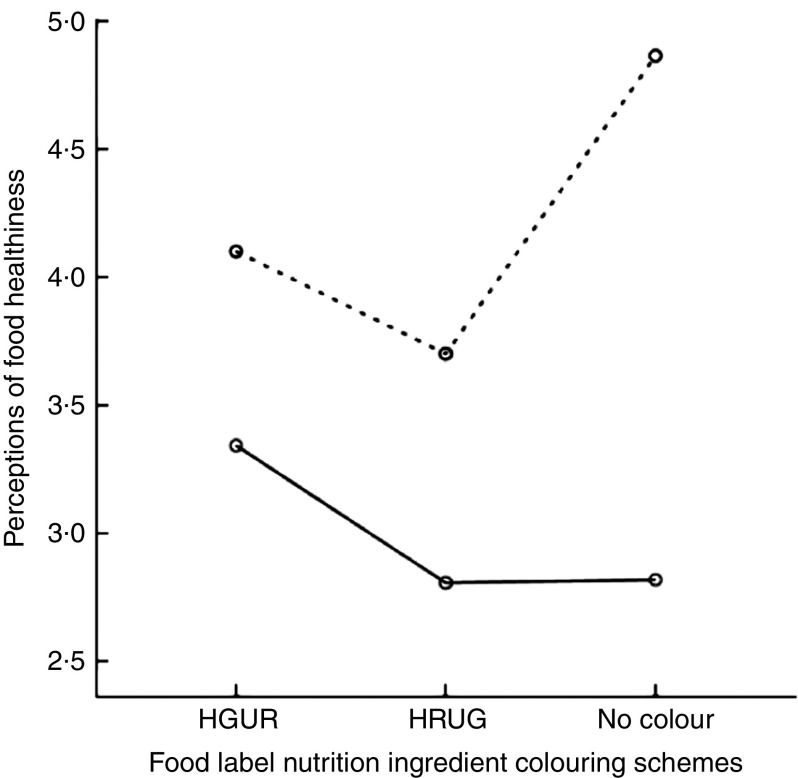
Fig. 2.
Means plot for the significant interaction between food label nutrient colouring schemes (HGUR, healthy=green, unhealthy=red; HRUG, healthy=red, unhealthy=green) and food category healthiness ( , healthy;
  , unhealthy) on perceptions of food healthiness among 196 respondents above the age of 18 years (males, n 82; females, n 114) sourced from a national consumer panel, USA

