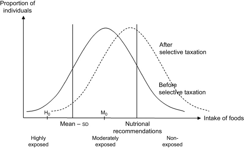
Fig. 2.
Illustration of the proportions of highly exposed, moderately exposed and non-exposed individuals before and after selective taxation. Baseline distribution (before taxation) is shown by the line ——, whereas the distribution of exposure after taxation is shown by the line – – –, illustrating how taxation would shift parts of the population towards a diet closer to the national nutritional recommendations, thereby decreasing the proportion of exposed individuals. H0 illustrates the median value for highly exposed and M0 the median value for moderately exposed. The plot illustrates exposure and changed exposure for foods where a high intake is recommended (e.g. fruit and vegetables)

