Figure 7.
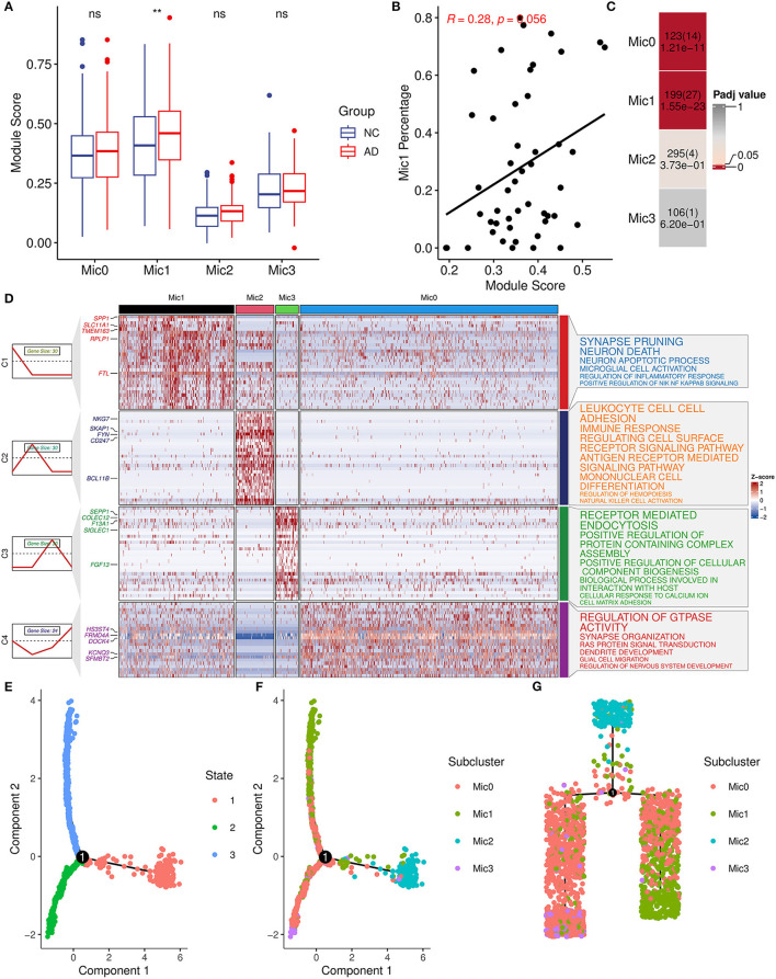
AIM-related microglia subcluster analysis. (A) Bar plot showing AIM expression in different microglia subclusters. Blue denotes the control group and red denotes the AD group. The Wilcoxon test method was used to compare the group difference. ns: p > 0.05, **p ≤ 0.01. (B) Scatter plot of the relationship between the module score and Mic1 percentage in the snRNA-seq microglia population. R represents the Spearman correlation coefficient. (C) Heatmap of Fisher's exact test for the overlapped genes from the AIM to different microglia subtype marker genes. The numbers in each grid denote marker gene size, overlapped gene size, and adjusted p-value. (D) Heatmap of scaled gene expression in different microglia subtypes. C1, C2, C3, and C4 represent marker genes of Mic1, Mic2, Mic3, and Mic0, respectively. The top five marker genes for each subtype were labeled. The right panel represented the enriched GO biological pathways of the corresponding marker gene set. The larger text size represented more significant enrichment results. (E) Trajectory plot of cells in the reduced dimensional space. Each cell was colored by inferred states and (F) was colored by microglia subclusters. (G) Trajectory tree of cells and each cell was colored by microglia subclusters.

