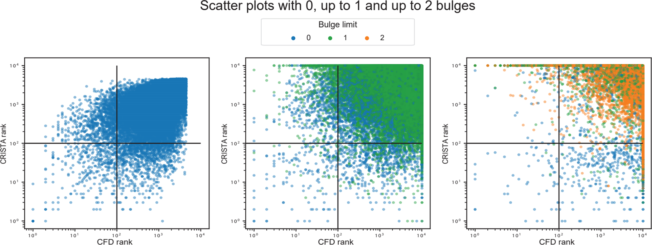
Extended Data Figure 2. Plots with rank ordered correlation between CFD and CRISTA reported targets.

Scatter plots show from left to right, the correlation of ranked targets, extracted by selecting top 10000 targets ordered by CFD and CRISTA score, respectively. The left plot shows the rank correlation of targets with 0 bulges (Pearson’s correlation: 0.57, p < 1e-10, Spearman’s correlation: 0.55, p < 1e-10), the center plot shows rank correlation of targets with 1 bulge (Pearson’s correlation: −0.16, p < 1 e-10, Spearman’s correlation: −0.33, p < 1e-10) and the right plot shows the rank correlation of targets with 2 bulges (Pearson’s correlation: −0.55, p < 1e-10, Spearman’s correlation: −0.80, p < 1e-10). The correlation values and p-values(two-sided) were calculated using standard functions from the Python scipy library. The colors represent the lowest count of bulges for each target, since the two scoring methods may prioritize different alignments and thus different number of mismatches and bulges of the same genomic target.
