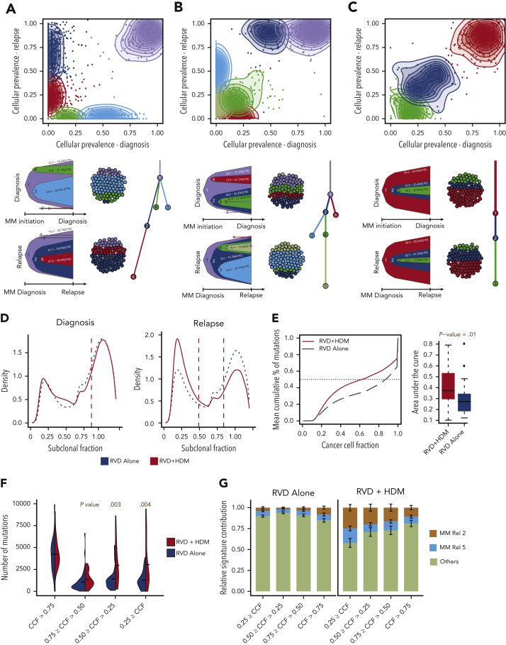
Figure 4.
Clonal evolution and complexity after HMD treatment. (A-C) Three representative examples of positive selection of subclones (A,B) and static evolution (C) patterns observed in patients after treatment. For each panel, CCF of mutations are shown at diagnosis (x-axis) and relapse (y-axis). Mutations were clustered using expectation-maximization algorithm, and clusters are color coded with densities around the clusters shown in shaded colors. For each pattern, most likely clonal evolution trees are shown (bottom). Fish plots (bottom left) are showing the clonal composition at a given time point (diagnosis [top] or relapse [bottom]), and a clonal evolution tree is also shown (bottom right). (D) Density (y-axis) of mutations at given a CCF (x-axis) for RVD-only (blue dashed line) and RVD + HDM (red solid line) groups at diagnosis (left) and relapse (right). (E) Mean cumulative percentage of mutations (y-axis) at a given CCF (x-axis) from all patients in the RVD + HDM (red curve) and RVD-alone (blue curve) arms. Boxplots (right) show area under the cumulative percentage of mutations curve for each patient at relapse for RVD + HDM and RVD-only arms. (F) Number of mutations (y-axis) at relapse by clonality levels (x-axis) between 2 treatment arms (color coded). (G) Relative mutational signature contribution (y-axis) from HDM-specific signatures (signatures 2 and 5) at 4 different clonality levels (x-axis). Rel, relative.

