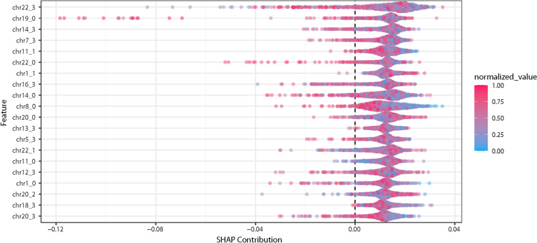
Fig. 3.
This Shapley additive explanations plot (known as a SHAP plot) provides interpretability to the machine learning model. This SHAP plot is from the UK Biobank machine learning model, shown in Fig. 1. In this model, we used the chromosome-scale length variation on four segments from each chromosome, numbered from 0 to 3. The normalized value represents the value of the parameters. For instance, the red points (closer to 1.0) represent the people with the “longest” associated chromosome, while the blue points (closer to 0) represent people with the shortest associated chromosome. This SHAP plot indicates that the top contribution to the model is from Chromosome 22, segment 3 (the top label on the left axis). However, the SHAP contribution plot also indicates that many different chromosomal regions contribute equally to the model. No one segment is responsible for a majority of the predictive value of the model. Thus, one should not ascribe any particular significance to the third segment of Chromosome 22

