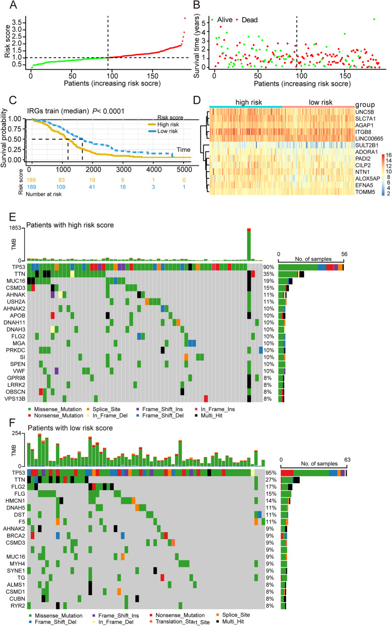
Fig. 6.
Identification of a risk signature comprising of 9 eccDNA genes in OV. A Distribution of patients in the TCGA cohort based on the median risk score. B The survival status for each patient (low-risk population: on the left side of the dotted line; high-risk population: on the right side of the dotted line). C Kaplan–Meier survival curve between high and low-risk groups. Red lines represent high risk patients, while blue lines represent low risk patients. D The heatmap of the expression profiles of 13 prognostic related genes signature. E Representative diagram of mutation landscape from the high-risk OV cohort. F Representative diagram of mutation landscape from the low-risk OV cohort

