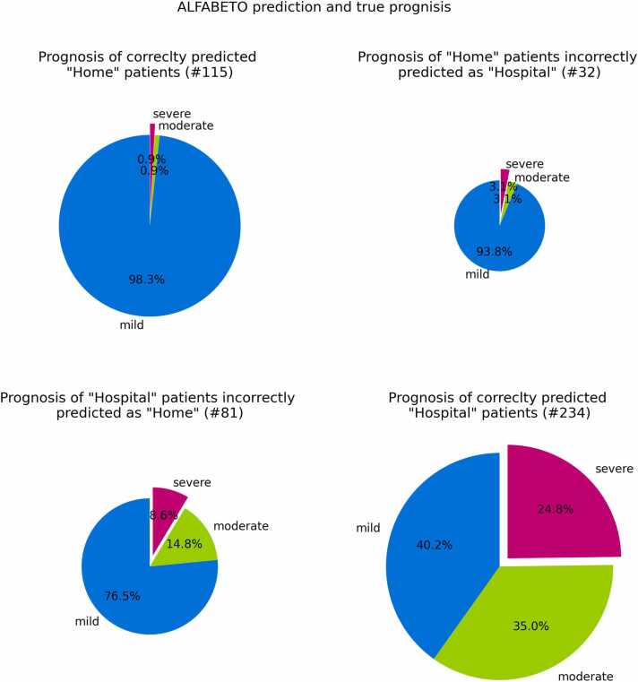
Fig. 2.
Prognosis of patients during the third wave. Each pie chart refers to a specific group of patients, identified by the true outcome and ALFABETO predicted outcome. For instance, the lower right pie chart reports the percentage of hospitalized patients correctly predicted as “Hospital” by ALFABETO. The different slices are proportional to the percentage of patients with mild, severe or moderate prognosis in each group.

