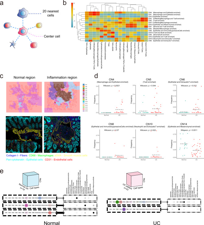
Fig. 6. Cellular neighborhood (CN) changes during UC.
a Schematic of CN identification. CN was defined by its center cell and the 20 nearest neighbor cells. b Identification of 15 distinct CNs based on the 17 original CTs and their respective abundances (column scaled) within each CN. c Representative Voronoi diagrams of CNs (upper panels) and corresponding IMC images (lower panels) in the normal and inflammatory region. d Dot plots showing the abundance of selected CNs (CN4, CN5, CN6, CN8, CN10, CN14) between normal and UC samples (Normal, n = 19; UC, n = 33 from two independent experiments). Dashed black line labeling mean value of each group and statistics were performed with two-sided Wilcoxon rank-sum tests. Exact P values were provided in the plot and Source Data file. e Schematic of the tensor decomposition analysis and decomposition results of selected modules for normal and UC groups. Weight of the line connecting CN and CT modules indicating interaction potentials between each pair.

