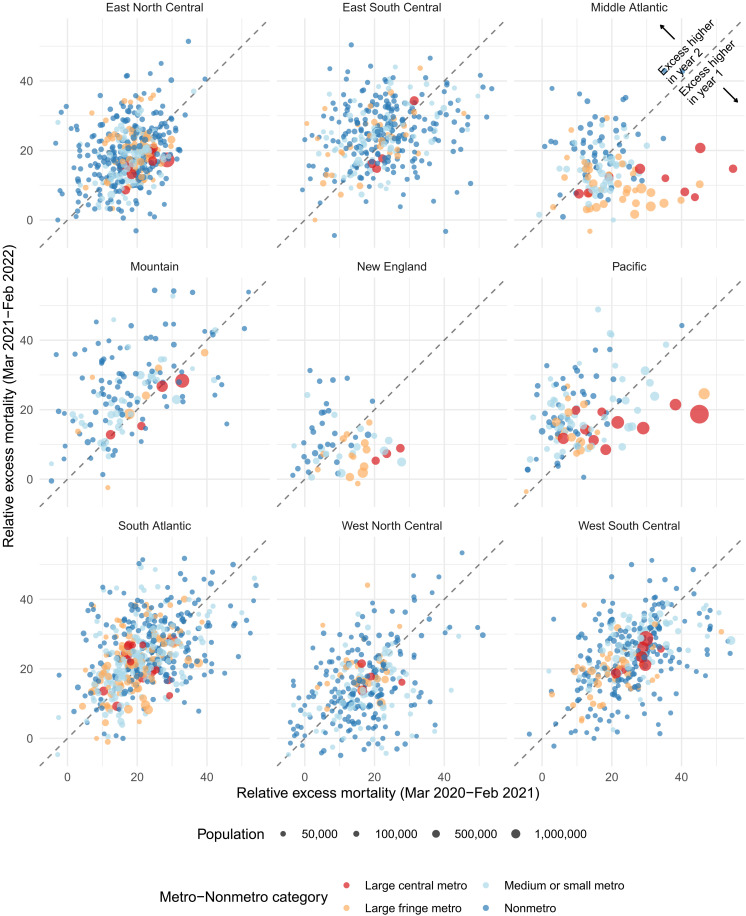
Fig. 4. Comparison of relative excess mortality by pandemic year, March 2020 to February 2022.
Each point in the graph represents a county and reflects its relative excess mortality from March 2020 to February 2021 (horizontal axis) and its relative excess mortality from March 2021 to February 2022 (vertical axis). We excluded counties with less than 10,000 residents to make the relationship between the two variables clearer. The 45° line separates the plot into two parts. Points above the line saw higher excess mortality in the second year of the pandemic compared to the first. Points falling below the line instead saw lower excess mortality in the second year compared to the first.

