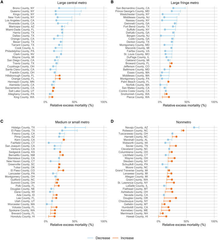
Fig. 7. Change in relative excess mortality between the first and second pandemic years in the most populous U.S. counties by metro-nonmetro category, March 2020 to February 2022.
(A to D) Each line in the four panels represents a county. For each line, the end point that is a vertical line reflects relative excess mortality in the first year of the pandemic (March 2020 to February 2021), while the end point that is a dot indicates relative excess mortality in the second year of the pandemic (March 2021 to February 2022). The color of the line distinguishes between counties that saw a decline in relative excess mortality (blue) and those that saw an increase (orange). The 30 most populous counties were selected for each metro-nonmetro category.

