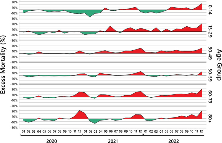
Figure 4. Monthly excess mortality.
For six age groups, the black lines show the monthly excess mortality from January 2020 to December 2022. The red-shaded areas show the periods where a mortality increase was observed; the green-shaded areas show the periods where a mortality deficit was observed.

