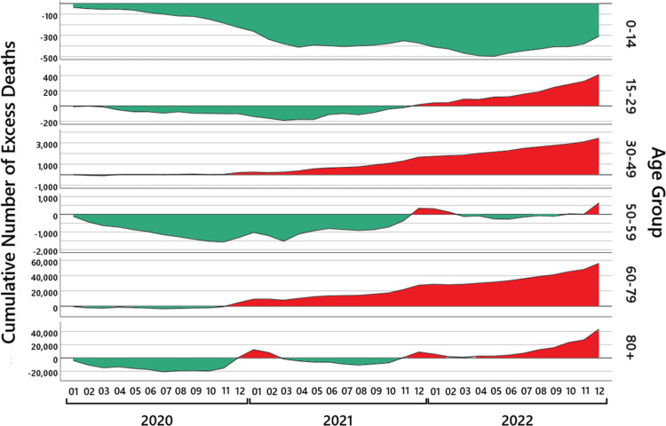
Figure 5. The cumulative excess mortality.
For six age groups, the black lines show the cumulative number of excess deaths from January 2020 to December 2022. The green areas show the regions of a cumulative mortality deficit and the red areas of a cumulative excess mortality. Note that the  -axis of the number of cumulative excess deaths is scaled differently depending on the age group.

