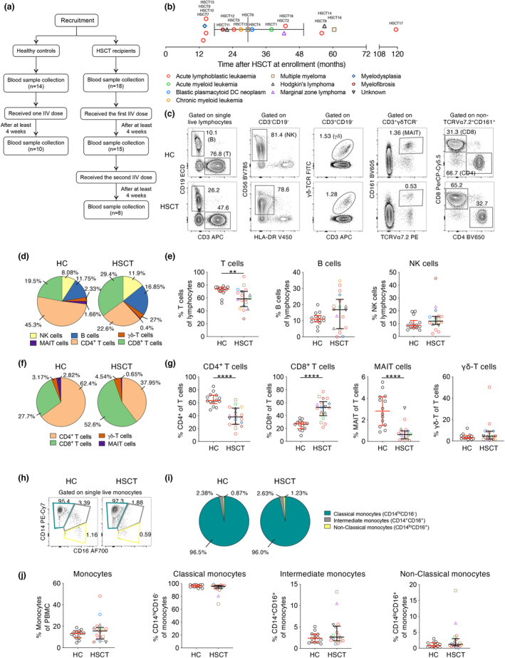
Figure 1.

Baseline cellular PBMC composition in HSCT recipients. (a) Recruitment of participants and study design. (b) Underlying disease and time after transplantation at enrolment of HSCT recipients. (c) Gating strategy of PBMC populations. (d) Distribution and (e) frequency of PBMC subsets. (f) Distribution and (g) frequency of T‐cell subsets. (h) Representative graphs, (i) distribution and (j) frequency of monocytes and subsets. Pie charts indicate median frequency. Bars indicate median and interquartile range. Symbols of HSCT recipients were the same as in (b). Technical replicates were not performed due to limited patient samples. Significance between the two groups was determined using the Mann–Whitney U–test (nHC = 14, nHSCT = 18; **P < 0.01, ***P < 0.001, ****P < 0.0001).
