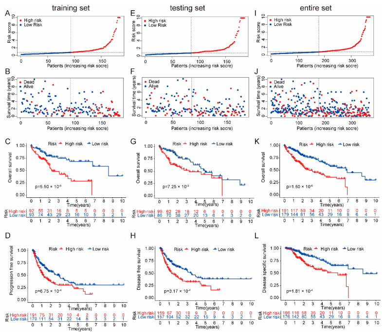
Figure 2.
Grouping and prognostic of the risk model. (A) The ranked scatter plots in the TCGA training set. (B) The survival state diagram plots in the TCGA training set. (C) The Kaplan–Meier survival curves plots in the TCGA training set. (D) The ranked scatter plots in the TCGA testing set. (E) The survival state diagram plots in the TCGA testing set. (F) The Kaplan–Meier survival curves plots in the TCGA testing set. (G) The ranked scatter plots in the TCGA entire set. (H) The survival state diagram plots in the TCGA entire set. (I) The Kaplan–Meier survival curves plots in the TCGA entire set. (J) The Kaplan–Meier survival curves plots. The PFS of patients in the high-risk group had significantly lower survival rates than those in the low-risk group. (K) The Kaplan–Meier survival curves plots. The DFS of patients in the high-risk group had significantly lower survival rates than those in the low-risk group. (L) The Kaplan–Meier survival curves plots. The DSS of patients in the high-risk group had significantly lower survival rates than those in the low-risk group.

