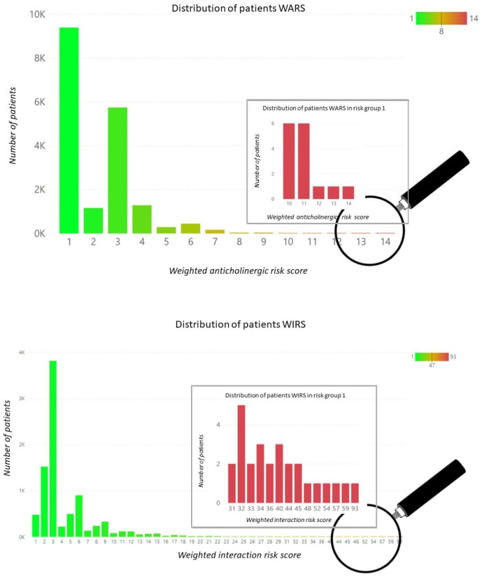
Figure 3.
Population distributions over the calculated weighted anticholinergic risk score (top panel) and the calculated weighted interaction risk score (bottom panel). In both cases, the respective complete distributions are represented by the green-shaded histograms, whilst the embedded red histograms represent an expanded view of the respective group 1 (highest risk) distributions. The magnifying glasses of both the top and bottom panels schematically represent the approximate location of these group 1 histogram subsets within their respective population distributions.

