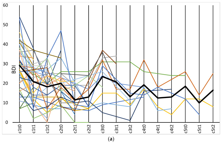
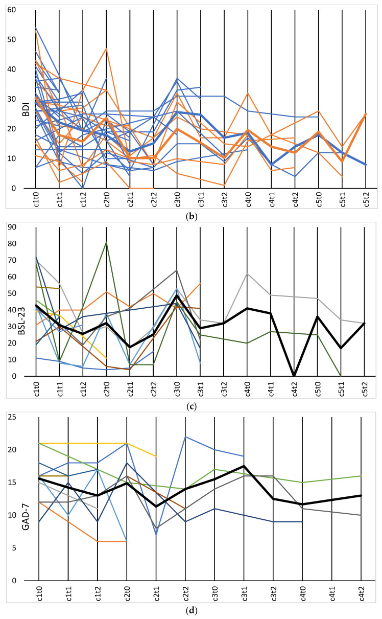
Figure 1.
(a) BDI data displayed as spaghetti plot (N = 36). The bold line represents the sample mean. (b) BDI data displayed as spaghetti plot with distinction between upper face treatment only (blue, N = 26) and upper and lower face treatment (orange, N = 10). The bold lines represent the sub-sample means. (c) BSL-23 displayed as spaghetti plot (N = 13). The bold line represents the sample mean. (d) GAD-7 displayed as spaghetti plot (N = 11). The bold line represents the sample mean.


