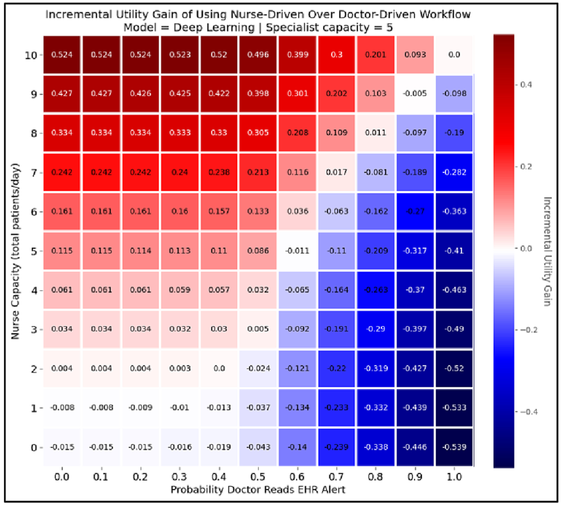
Fig. 7.

This heatmap shows the incremental gain from using the nurse-driven workflow over a doctor-driven workflow at a given capacity level for each workflow, assuming a specialist capacity of 5 patients/day. The y-axis represents capacity for the nurse-driven workflow, and the x-axis represents the probability that a doctor reads an EHR alert in the doctor-driven workflow. The value of the cell at coordinates (i, j) in the heatmap shows the incremental gain in achievable utility that can be expected by using a nurse-driven workflow with capacity i instead of a doctor-driven workflow with an alert fatigue level of j. Thus, positive numbers (i.e. red cells) indicate that the nurse-driven workflow is preferable to the doctor-driven workflow at their corresponding capacity levels, while negative numbers (i.e. blue cells) are situations in which the doctor-driven workflow should be preferred. That is why the top rows, which show nurse capacity at its highest, are dark red, while the farright rows, which represent the highest probability that doctors read their EHR alerts, are dark blue.
