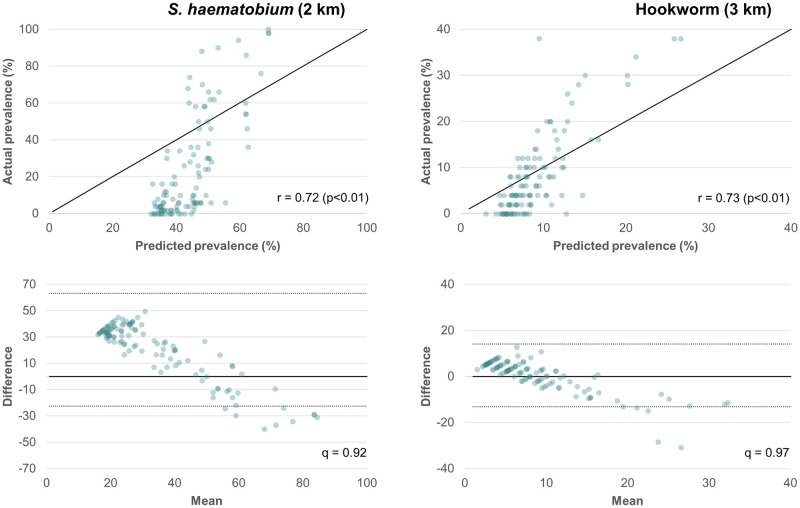
Fig 4.
Top row shows a scatter plot of actual (y-axis) versus model predicted (x-axis) prevalence for the unmasked 2008 models as compared to the diagonal line of equality; r is the correlation between observed and predicted values. Bottom row shows a scatter plot comparing the average of observed and predicted prevalence values (x-axis) to the difference between these values (y-axis) with mean difference indicated by a solid line and 95% limits of agreement indicated by dashed lines; q is the proportion of predicted values within the limits of agreement.

