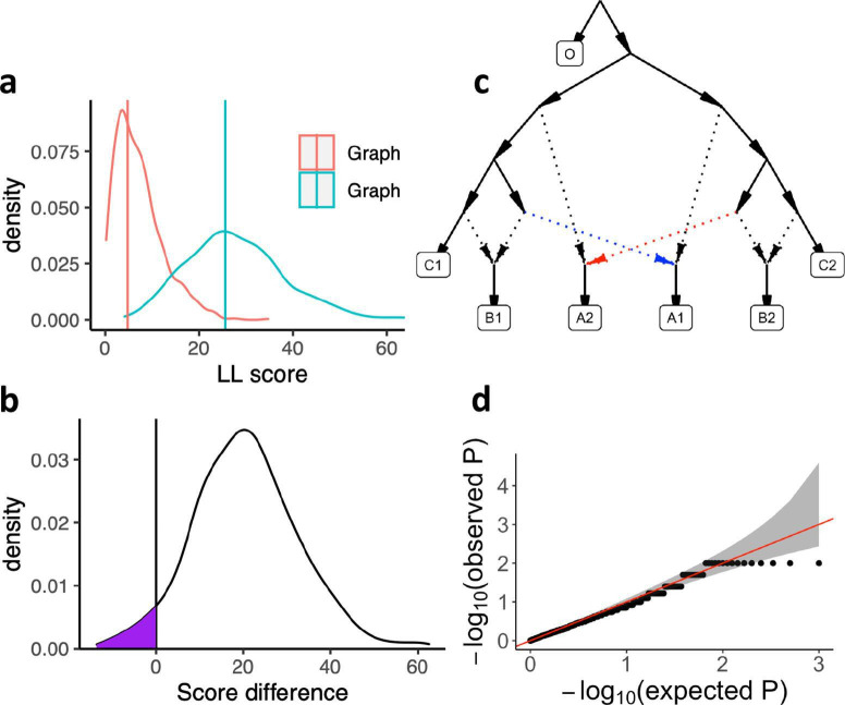
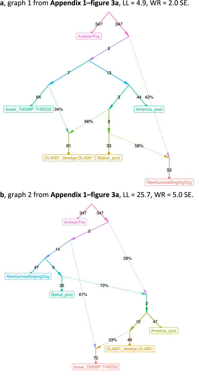
Appendix 1—figure 3. Calibrating the bootstrap model comparison approach.
(a) Bootstrap sampling distributions of the log-likelihood scores for two AGs (shown in Appendix 1—figure 3—Figure supplement 1) for the same populations fitted using real data. Vertical lines show the log-likelihood scores computed on all SNP blocks. (b) Distribution of differences of the bootstrap log-likelihood scores for both graphs (same data as in a). The purple area shows the proportion of resamplings in which the first graph has a higher score than the second graph. The two-sided p-value for the hypothesis of no difference is equivalent to twice that area (or one over the number of bootstrap iterations if all values fall on one side of zero). In this case it is 0.078. (c) The AG which was used to evaluate our method for testing the significance of the difference of two graph fits on simulated data. We simulated under the full graph and fitted two graphs that result from deleting either the red admixture edge or the blue admixture edge. These two graphs have the same expected fit score but can have different scores in any one simulation iteration. (d) QQ plot of p-values testing for a score difference between the two graphs (on simulated data) under the hypothesis of no difference, confirming that the method is well calibrated.


