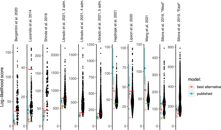
Figure 2. Log-likelihood (LL) scores of published graphs (those shown in Table 1) and automatically inferred graphs.
Each dot represents the LL score of a best-fitting graph from one findGraphs iteration (low values of the score indicate a better fit); only topologically distinct graphs are shown. LL scores for the published models and best-fitting alternative models found are shown by blue and pink x’s, respectively. Bootstrap distributions of LL scores for these models (vertical lines, 90% CI) and their medians (solid dots) are also shown. Lower scores of the fits obtained using all single-nucleotide polymorphisms (SNPs), relative to the bootstrap distribution, indicate overfitting. Green and red horizontal lines show the approximate locations where newly found models consistently have fits significantly better or worse, respectively, than those of the published model. In the case of the Bergström et al., Lazaridis et al., and Hajdinjak et al. studies, one or more worst-fitting models were removed for improving the visualization. The setups shown here (population composition, number of groups and admixture events, topology search constraints) match those shown in Table 1.

