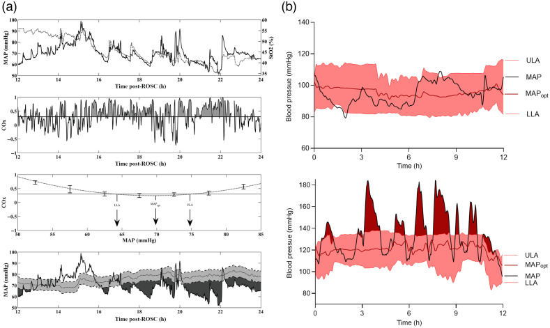
Fig. 2.
Examples of using NIRS derived autoregulation indices to identify . (a) Data from a pediatric cardiac arrest patient. Top graph shows the time course of fluctuations in MAP and over a 24-h period. Second from top, temporal fluctuations in COx are shown. Periods of time with poor autoregulation (i.e., ) are shaded gray. Second from bottom, method for deriving (MAP where COx is minimized) and both ULA and LLA (BP where COx > 0.3) is shown. Bottom graph shows temporal trends in superimposed on top of the patient’s actual BP. Areas shaded dark gray represent periods of time when actual MAP was significantly below (defined as periods where ). (b) Similar data from adult patients with non-traumatic subarachnoid hemorrhage. Black trace represents patient’s actual MAP, red trace represents trends in calculated from COx. Shaded red areas represent the range of intact autoregulation. The top curve shows a patient with BP trends where MAP largely stayed within ULA and LLA, whereas bottom curve shows a patient where BP often exceeded the ULA. [(a)- taken from Ref. 30 and (b)- taken from Ref. 31].

