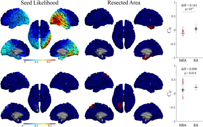
Figure 5. .
Seed-likelihood maps for two representative cases. Left panels show the seed likelihood of each ROI, CR, for two exemplary cases (cases 13 and 15, respectively, from top to bottom), whereas the middle panels show the corresponding resection areas in red. The right panels indicate the comparison between RA and non-RA (NRA) ROIs, for these two cases (unpaired t test). The solid lines stand for the mean values. Red pluses mark outliers (1.5 times over the interquartile range).

