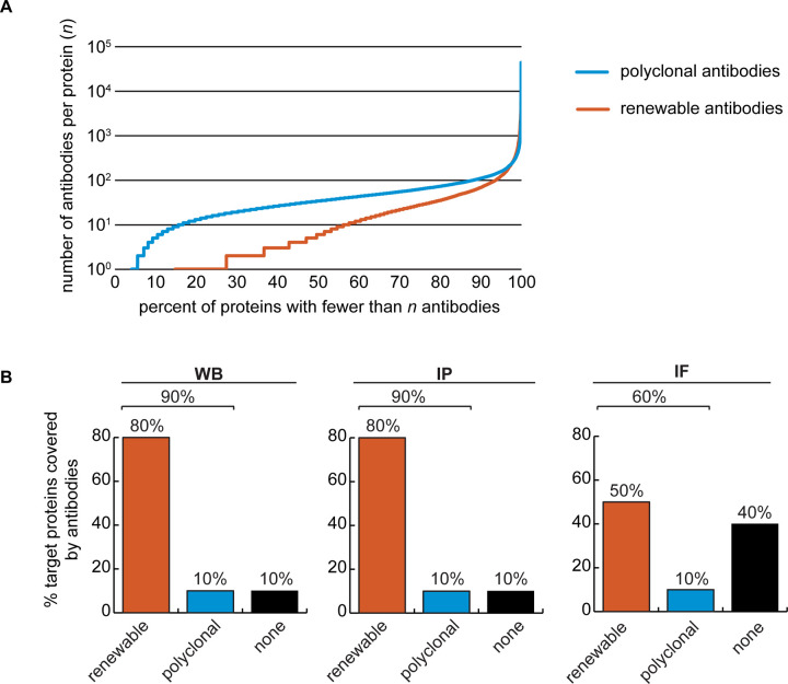
Figure 2: Analysis of human protein coverage by antibodies.
(A) Cumulative plot showing the percentage of the human proteome that is covered by polyclonal antibodies (blue line) and renewable antibodies (monoclonal + recombinant; orange line). The number of antibodies per protein was extracted from the Antibody Registry database. (B) Percentage of target proteins covered by minimally one renewable successful antibody (orange column) or covered by only successful polyclonal antibodies (blue column) is showed for each indicated applications using a bar graph. Lack of successful antibody (“none”) is also shown (black column).

