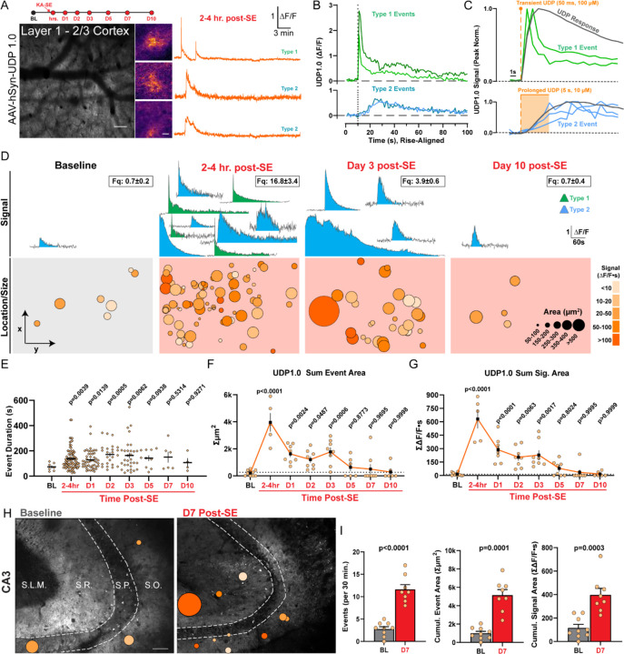
Figure 2: Enhanced UDP release occurs following status epilepticus.
(A) In vivo 2-photon study timeline and image of UDP1.0 expression. Scale bar, 100µm. Examples of UDP sensor event fluorescence and corresponding ∆F/F traces. Scale bar, 20µm. (B) Examples of Type 1 sharp-peak events and Type 2 events with slower rise (∆F/F traces aligned to rise start time). (C) Modeling Type 1 and Type 2 rise kinetics (peak normalized) against transient or prolonged UDP application ex vivo (gray trace). (D) Example UDP sensor signals (top, ∆F/F) and sensor event size/location under the cranial window (bottom) at baseline and during epileptogenesis. The number of ∆F/F signals displayed (top) is meant to convey frequency (frequency box represents mean ± S.E.M events per 30 min recording). Event size/location displays all events aggregated across a longitudinal cohort of N=3–5. (E) Duration of UDP release events (dot: a single event). (F) The cumulative area covered by UDP sensor events over a 30 min period (dot: one imaging region). (G) The cumulative UDP ∆F/F∙s signal recorded over a 30 min period (dot: one imaging region). (H) Overlay of UDP sensor events ex vivo in the CA3 region of hippocampus. Scale bar, 70µm. Event scale as in (D). (I) Quantification of either UDP event frequency, cumulative UDP release area, or cumulative UDP signal area per 30 min. Welch’s T-test (dot: one or 2–3 CA3 regions surveyed from N=4 mice per time point). Data represent the mean ± SEM. D-G: Longitudinal study of 2 non-overlapping regions from N=3–5 mice. E-G: One-Way ANOVA with Fisher’s post-hoc testing vs. baseline for statistical comparison.

