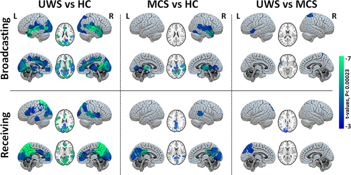
FIGURE 6.

Group comparison of regional broadcasting and receiving capacities after exogenous perturbations. Maps of regional contrasts in broadcasting and receiving capacity between study groups. Color bar represents the t‐values for regions with significant between‐group differences (Bonferroni corrected p‐values < 0.05 for 214 tests (brain regions).
