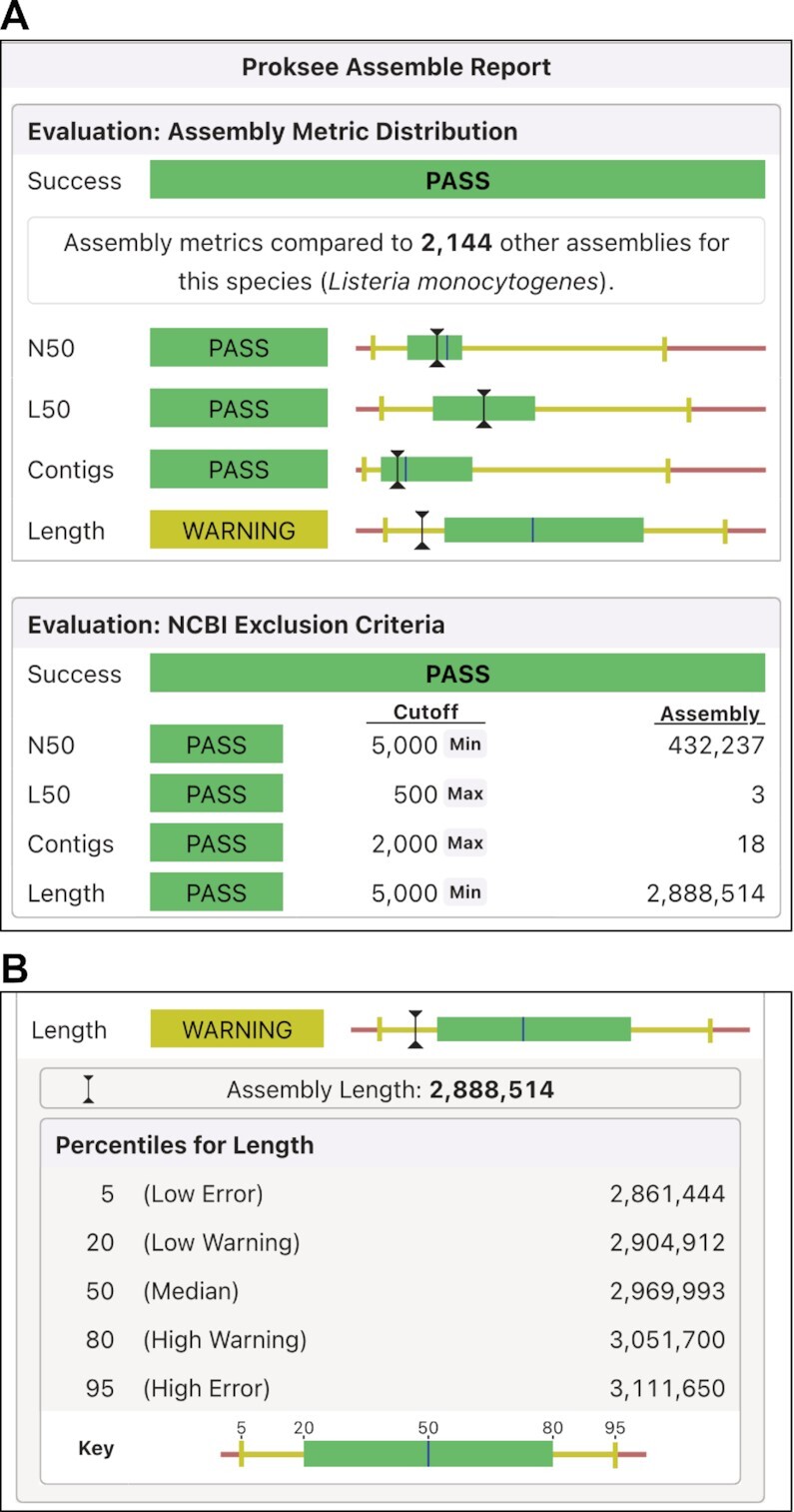
Figure 2.

Assembly report. (A) Assembly metric distribution (top) shows the assembly values compared to Proksee's custom reference database of existing assemblies for the same species. NCBI exclusion criteria (bottom) compare the assembly to NCBI’s reference sequence exclusion criteria. (B) Metric distribution details are shown when a metric is clicked. The distribution is displayed as a bar plot with the median length shown as a blue vertical line; the 20th percentile to the 80th percentile shown as a green box; the 5th to 20th percentile and 80th to 95th percentile shown as yellow lines; and above the 95th or below the 5th percentile shown as red. A black I-beam indicates the value of each metric for the project assembly.
