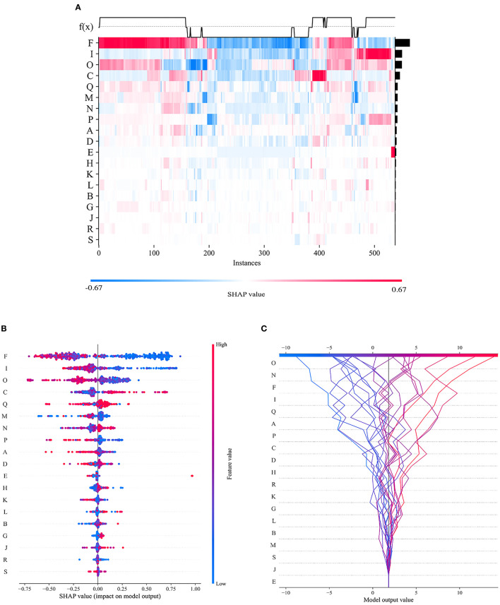
Figure 10.
Visual interpretation of the importance of selected features. (A) Feature density scatterplot: each column represents a sample, and each row represents a feature; the features are sorted by their average absolute SHAP values; red represents the positive direction, and blue represents the negative direction. (B) Feature distribution heatmap: each point represents a sample, the samples are sorted by their SHAP values, and the absolute SHAP value of a feature represents its contribution to the model. (C) Feature decision diagram: this figure represents the accumulation of all samples and features as well as model's decision-making process.

