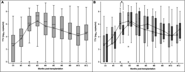
Figure 1.
TTV load dynamics measured at transplantation (D0) and at month (M) 1, 2, 3, 4, 5, 6, 8, 10, and 12 after transplantation. The results are presented in the overall study population (A), and in the subgroups of patients with (light grey) and without prophylaxis (dark grey) at D0 (B). Mean values are displayed on the graph as points. Median values are represented by bars, and the interquartile range is represented by boxes. Significant differences are represented in the figure by an asterisk (p < 0.05).

