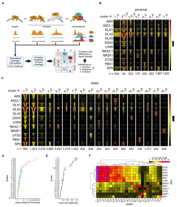
Figure 2 – Organization of Bound Loci into Clusters of Similar Binding Neighborhood Profiles.
(A) Schematics showing the several binding patterns captured by investigating local neighborhood around ChIP-seq peak summits, as well the subsequent clustering and following genomic profile characterization. (B) and (C) Heatmaps representing each TF coverage around 1 kb of each called peak in proximal and distal regions, respectively. Row blocks and columns depict TFs and clusters, respectively. Within each row block, each line represents the coverage color-codes for intensity of ChIP-seq signal (intensity grows in the black-to-yellow-to-red direction). Within each cluster, lines with same position across the TFs represent the same genomic locus. Numbers (n = ) indicate the number of peaks called within each cluster. (D) Distribution of mean number of TFs bound to each locus across clusters. Mean distributions were calculated by sampling without replacement (N=1000). Random means was calculated by randomly sampling the genome (N=27398). (E) Distribution of mean number of TFs sharing loci across binding clusters, and compared to a random sample, calculated by sampling without replacement (N=1000). (F) Heatmap showing the relative enrichment of core binding motifs for each of the TFs across clusters. See also Figure S2.

