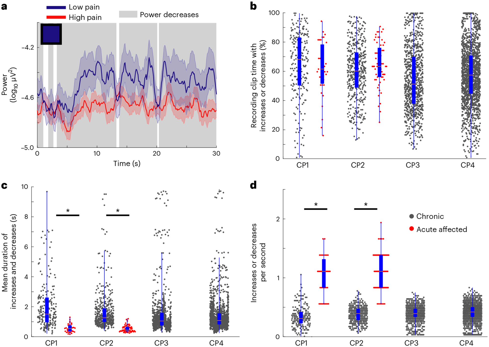
Fig. 5 |. Temporal dynamics of power features distinguish chronic from acute pain states.

a, Example power time-series plot of a single feature (contralateral OFC delta) averaged across all recordings from low (blue line) versus high (red line) pain states, for one participant. Colored and shaded error bars show the s.e.m. The blue square in the upper-left corner represents that feature’s average weight as plotted in Fig. 2e (blue indicates negative weight ~ −1.0). This negative feature weight corresponds to decreased mean power during high pain states; periods of decreased power are highlighted with background gray shading. b, Box plots with overlying raw data of the percentage of total recording clip time on which increases or decreases occurred for chronic pain features (black dots) and acute pain features (red dots). c, Mean duration of bouts of increases and decreases similarly. d, Number of increases or decreases per second for chronic and acute pain features; the symbol legend in d applies to b–d. In b–d for CP1–4 chronic pain features, respectively, n = 215, 455, 880 and 1,765 independent power time series. For CP1 and CP2 acute pain features, respectively, n = 35 and 60 independent power time series. Box plot bounds indicate the 25th and 75th percentiles, the pink line shows median, and whiskers show the full extent of data from minima to maxima with points outside the whiskers considered outliers. Two-sided Wilcoxon rank-sum tests with correction for multiple comparisons. In c, ZCP1 = 7.7, *P = 10−14; ZCP2 = 11.6, *P = 10−30. In d, ZCP1 = −8.9, *P = 10−19; ZCP2 = −12.5, *P = 10−35. See Supplementary Fig. 13 for additional details and the top five features per participant.
