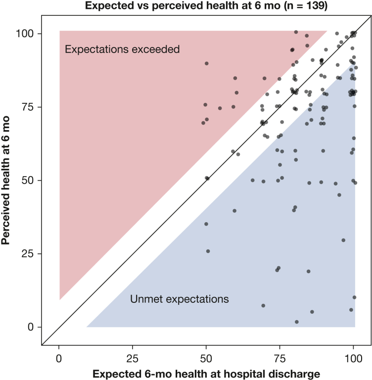
Figure 1.
Scatterplot showing expected vs perceived health 6 mo after acute respiratory failure. At enrollment near the time of hospital discharge, participants were asked to indicate how good or bad they expected their health to be after 6 mo using a visual analog scale (VAS) ranging from 0 to 100 (with higher score being better health). At the 6-mo follow-up, participants were asked about their perceived health using the EQ-5D VAS, that also ranges from 0 to 100. The unshaded area represents the minimal clinical important difference (MCID) for the VAS of 8 units. Participants in the unshaded area were classified as having their health expectations met. The blue region contains participants whose perceived health was worse than expected by more than the MCID, whereas the pink region contains participants whose perceived health was better than expected by more than the MCID. Points have been jittered ± 1 unit in the horizontal or vertical directions for clarity. Shaded areas have been shrunk by 1 unit to ensure that no point extends into a shaded region as a result of jittering.

