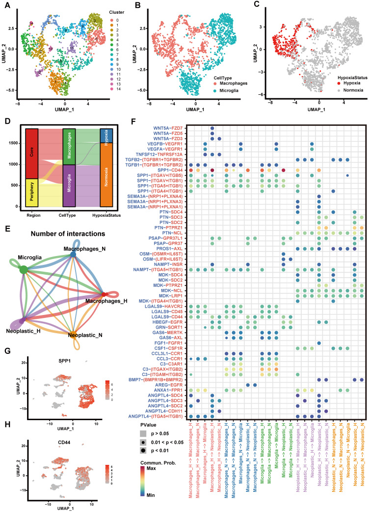
Figure 3.
Cell-cell communication between immune cells and tumor cells. (A-C) The UMAP plot showing immune cells. (A) Different colors labeled for 15 clusters, respectively. (B) Different colors labeled for different cell types. (C) Different colors labeled for different hypoxia status. (D) Sankey diagram showing the connection of cell types, cell collected regions and hypoxia status in immune cells. (E) Cell-cell interaction network of hypoxic tumor cells, normoxic tumor cells, microglia, hypoxic macrophages, normoxic macrophages. The node size represents the number of interactions. The width of the edge represents the number of significant ligand-receptor interactions in two cell types. (F) Bubble heatmap showing cells interaction strength for different ligand-receptor pairs. Dot size indicates p-value generated by the permutation test and dot color represents communication probabilities. Empty space indicates that the communication probability is zero. (G-H) The UMAP plot showing the SPP1 (G) and CD44 (H) expression level in all cell types.

